


Financial services apps are some of the most used applications in the world. There are currently 1.3 billion mobile payment users globally‚ the top four online trading apps have $77 billion of assets under management and challenger banks such as Monzo have over four million app users (1).
That’s a lot of users so it’s important to develop accessible financial services apps across web and mobile.
One area where this is a challenge is colour accessibility. Financial services apps with strong brand identities can struggle to meet colour accessibility guidelines‚ making the user experience difficult for customers with visual disabilities and impairments.
What is colour accessibility?
W3C‚ the body that sets the standards for web accessibility‚ has two principles when it comes to colour accessibility:
-
Colour is not used as the only way of conveying information or identifying content
-
Default foreground and background colour combinations provide sufficient contrast
A Click-Away Pound Survey found that 71% of individuals with disabilities abandon a website that’s difficult to use – which amounts to an estimated annual loss of £11.75 billion in revenue. So it makes both business and moral sense to embed accessibility at the core of financial services web and mobile app development.
Let’s take a look at how to improve colour accessibility in financial services apps without sacrificing great design.
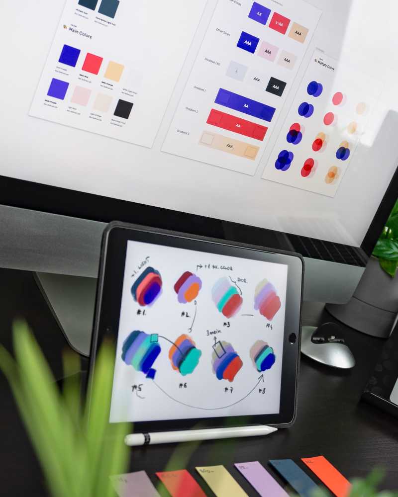
Use brand colours wisely
Financial services companies rely heavily on brand identities that build their corporate reputations and make them stand out in a crowded marketplace.
It’s understandable that they want to apply their brand identity to their digital products‚ but powerful brand colours don’t always translate into accessible app design.
During our discovery workshops and design sprints‚ hedgehog lab’s UX/UI designers help clients to use their brand identity in the right way to get the ideal balance between great design and accessibility.
When discussing the role of colour accessibility and introducing the concept to our clients one of our UX designers‚ Jack Mercer said typically
“We’ll have conversations and do workshops with the client to explore colour/brand adjustments to ensure accessibility is considered. The output of the workshop might be that we introduce accent colours to provide contrast‚ therefore meeting accessibility baselines.
We also consider things like colour psychology and how perceptions about certain colours might affect user experience. This in itself is full of complexity which is one of the reasons why we always encourage user testing early on in the product development lifecycle to get user feedback”.
Use tools to check compliance
Three great plug-ins are available to make sure your digital products comply with colour accessibility standards.
-
Able – analyses how well two colours work together and simulates what your choices will look like through the lens of different types of colour blindness.
-
Contract Checker – checks the contrast ratio of any two colours and shows how they appear against W3C’s standards.
-
Color Blind – simulates how colour choices will look on the colour blindness spectrum.
Find out more about these tools here.
Don’t solely rely on hardware
Improvements to hardware are making it easier for users to customise their devices. For example‚ iPhones have a built-in accessibility function where display‚ text and button size and contrast can be changed.
But that isn’t enough for some disabled users so we need to embed colour accessibility standards into financial services app designs from the start.
We should also remember that not everyone has a smartphone or internet access at home. Those using library computers to get online‚ for instance‚ won’t be able to adapt settings as freely as on a personal device.
Let us help you
We’ve used these tools and techniques to develop a range of web‚ mobile and cross platform apps for global financial services companies. Take a look at our past work here.
Accessibility is really important to us and we love opportunities to apply our expertise to developing new or existing digital products. We are currently working on a guide to web accessibility which will be available in June. In the meantime get in touch to find out how we can help you improve the colour accessibility of your digital products.
-
‘Fintech App Revenue and Usage Statistics 2021’‚ Business of Apps