

Following on from our piece identifying the most common cognitive biases in user research‚ here we’ll explain how developing knowledge of user psychology can help designers craft great products.
For modern day designers‚ it is a great idea to have an understanding of user psychology. Doing so will provide you with a better idea of user needs and desires‚ and help to increase the longevity of the product you are designing. Design fads come and go‚ but psychology does not (well‚ not without evidence)!
In this blog‚ we will give you a rundown of a few basic psychological principles that you can follow to assist in the pursuit of great design.
Gestalt principles.
![[object Object]](http://images.ctfassets.net/o6514hijae09/VtGitisejApC2FaflC1SS/398c28ed27bc3fe504ad8f950f5aefc4/coglode.jpg "[object Object]")
We enjoy receiving behavioural insights in our regular coglode Nuggets deliveries!
Everyone and their mum must be aware of Gestalt principles in design‚ but I thought I would include them nevertheless as they are a must know for any budding designer.
There are six main individual principles which are typically involved in this theory:
-
Proximity
– when items are seen closer together‚ they are thought to be a group even if the individuals are a different shape
-
Similarity
– this and proximity mostly work together‚ but here we perceive an even closer relationship when the individual assets look similar
-
Continuity
– elements arranged on a line or curve are seen to be more related than elements not on the line or curve
-
Closure
– The idea that we see complete objects where they don’t exist due to the negative space in other shapes
-
Figure
– people instinctively perceive objects as either being in the foreground or the background symmetry and order – users regard symmetrical elements to be part of the same thing‚ meaning we consider them as one single element.
Selective disregard.
Selective disregard is the effect which causes the user to stop paying attention to areas or elements as they become increasingly accustomed to them. Instead of digesting the repeated information‚ users will start to block it out.
Think about it‚ when was the last time that you noticed a banner advertisement? That might be because you have begun to disregard it. To improve this‚ ensure that everything that the user sees has a purpose. Designs that are uncomplicated tend to encourage users to gravitate towards them‚ and ultimately serves to make their experience of the website better.
Habits.
![[object Object]](http://images.ctfassets.net/o6514hijae09/5Xk1sOYw8Xm5AK4oCvbTPV/f27e6641bc68636d90a5a8b5e5302fc4/Emily_Sunderland_Digi.jpg "[object Object]")
A hedgehog team member at a Sunderland Digi event.
Through design‚ you can create features that get your users returning frequently. One of the most effective methods to use is the hook method which comprises of 4 main elements; trigger‚ action‚ reward and investment.
The trigger is the reason that the user comes to your product‚ and can be an internal (completing something new) or external (advertisement) trigger. Action is the reaction to the trigger‚ the user using the product; which will be followed by some form of reward. Investment meanwhile is the key to bringing users back to a product‚ and can often be found as some form of commitment‚ such as signing up for a subscription.
Reading patterns.
To find where they need to go‚ users don’t read‚ they scan pages! The most common reading patterns users employ are the F and Z. Text-heavy pages such as news articles tend to employ the F shape pattern most often‚ with navigation performed through a bar at the top of the page.
The Z shaped pattern meanwhile is more often exercised on pages where text is not the main focus‚ such as a sign-up service‚ where the end goal is for a user to complete a call to action. Utilising these patterns in your designs will make navigation much more comfortable for your end users.
Von Restorff Effect.
The Von Restorff Effect‚ also commonly known as the “isolation effect”‚ states that elements which are distinctive are more likely to be remembered than more ordinary items. Therefore to stand out‚ important information should be highlighted by a variety of colours‚ sizes and other distinguishing characteristics‚ as this will increase the likelihood of a user both noticing and remembering the element. However‚ this should be used sparingly as when overused this effect becomes overwhelming‚ and can ultimately cause the opposite of its desired effect.
![[object Object]](http://images.ctfassets.net/o6514hijae09/7IbZUgtMUvi5LUtBm5B2Ot/f29a58f953ed69a5265814ca73aeda2a/nwl_alexa_workshop1.jpg "[object Object]")
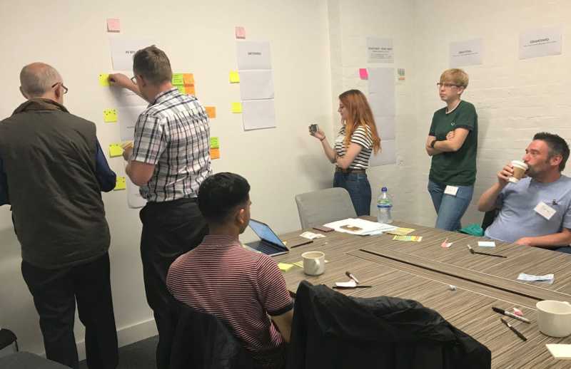
A user research workshop with the Northumbrian Water team.
Miller’s Law.
Cognitive overload is something which‚ as a designer‚ you want to avoid. Overloading your users can confuse them and‚ in turn‚ make them less likely to return to your product. One way to overcome this is through Miller’s Law‚ which states that people are typically able to retain a list of information 7 (plus or minus 2) items long. This law emphasises the benefits of “chunking” to ease the cognitive load of complex tasks by grouping information into related features.
![[object Object]](http://images.ctfassets.net/o6514hijae09/vT9RhjyWcm4wSDRIuvyf6/2b88abb8e38c7820cf32fefd8a397734/uxr_caitlin_laura_emily.jpeg "[object Object]")
UX Researchers presenting to the hedgehog lab team.
If you have been following hedgehog lab’s user research Twitter account‚ you may have seen some of these psychology insights! If not‚ you’ve been missing out so give us a follow on Twitter‚ @hedgehoglabUXR.
Designer? Let us know how you view psychology in design over on Twitter‚ @hedgehoglab and @hedgehoglabUXR.