


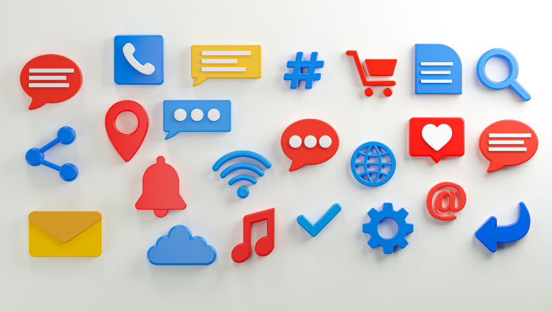
ON YOUR MARKS
For a quick introduction‚ I’m a UI/UX and mobile app designer based in Newcastle. Icons are everywhere‚ literally. On the door to the toilet at work‚ the packaging on your sandwiches‚ right across to those found in abundance on your phone. Over the countless number of years I have been designing‚ I have been subjected to both good and damnable icons and symbolism. However‚ through working within design agencies‚ I have seen patterns emerge.
It seems to me that it is not down to a designer’s practical ability‚ but instead the experience they have had. Iconography‚ like any task‚ requires a learning curve and practice in order to get it right – after all‚ it’s a practice stemming all the way back to Egyptian hieroglyphics and their use of symbols for word representation. And so I thought I would jot down the key do’s and don’ts when it comes to creating a set of digital icons.
01. HAVE A POINT
Understand that though icons can be a powerful tool and have shown real value in the app world‚ though they’re not always needed nor appropriate. In fact‚ in some cases the use of icons when a simple word will suffice is often a source for confusion for the user.
If you’re about to undertake the task of designing a set of icons or even browsing for someone else’s to use‚ think to yourself first: “why am I using this?” Now‚ there might be a genuine reason why the use of an icon is needed‚ such as language barriers or common association‚ but you’ll find a regular response will be “because it looks mint.”
This is issue No. 1 for me. Linking this to the user experience‚ you can have the chicest‚ most stunning set of screens for an app or website‚ but if the user gets lost on the journey or simply doesn’t understand what an icon means‚ you’ve failed.

02. KNOW YOUR USER
Understanding who the audience is that you’re designing for is crucial‚ knowing how they interpret the icons you’ve used is absolutely key. I’ve seen icons that are beautifully designed but could have so many different meanings‚ and ambiguity leads to frustration.
A few rules to follow when trying to sway the way in which the user interprets an icon are as follows:
(i) Research. Primary (first hand) research will always give you the best insight into how your target audience thinks and operates. Don’t assume you know how they think; make a survey‚ have a conversation‚ get off your bum and find out.
(ii) Language. The scale of your work dictates what icon or combination of icon or wording to use to get your message across. If you’re designing for one country then wording can be far more user friendly than icons. However‚ icons have the unique ability of breaking down language barriers if you’re designing for a global market.
(iii) Regions. Different cultures and regions have different meanings for symbolics‚ gestures and icons. For example‚ a ‘thumbs up’ is generally accepted around the world as a sign of approval . But be wary of it’s use in Islamic and several Asian countries‚ as you may as well of stuck your middle finger up whilst making a ‘yo momma’ joke.
(iv) Instinct. You should never make the user think of how to do something‚ it needs to be almost instinctive. Users need to be taken down a path of least resistance; through an app or website that requires no real thought into each decision they make.
03. A PLAN & STRATEGY
You might have the “ah‚ I’m class‚ I’ll just do them when I need them” attitude that so many designers seem to have but I can assure you that sitting back and sketching out the screen you’re designing allows you to work out the icons that are really needed. This gives you time to come up with a strategy and plan of attack. You need to include how prominent the icons need to be (hierarchy)‚ how often they will be used‚ their location on a page and most importantly whether or not they are actually appropriate.
Planning also entails a good amount of research. You need to be aware of the common themes of icon association‚ as well as the trends behind and conversion rate of certain icons.
Once you have this down‚ you can take it into a digital space and start creating them using a grid method‚ enabling you to instantly see the benefits of planning.
04. FAMILY FIRST
It’s true‚ family is one of the most important things. Using a collection (family) of icons that all look and feel as if they belong with each other creates a degree of consistency‚ which equals uniformity. Integrating this into an organisation’s style guide emits a strong brand identity.
Matching iconography to UI design and other graphics appropriately is fundamental to to the success of a piece.. This links back to point 2 (know your user)‚ but icon families can say a lot about a company and can sway a user’s decision to‚ for example‚ follow with a purchase. So getting it right is imperative.
For example‚ Instagram recently (2016) went through a redesign for their mobile app ( iOS‚ Android). Originally they used a set of icons that – in my opinion – came across as monotonous and simply a safe bet; no flair or creativity.
For example‚ the profile icon they used until early 2016 follows the same design principles and style that Facebook had in 2005
Now this is fine practice but to grab the attention of your user‚ the icons you use need to have individual flare and be seen as unique to that brand‚ not generic and banal. However‚ in the midst of the ‘hipster’ uprising on social mediums such as their own‚ Instagram saw their shortcomings of missing their target audience in UI of the app. They redesigned and created a modern‚ individual‚ vibrant icon family to match their youthful and individual audience.
05. FINE < FINITE
What I mean by the equality ‘fine < finite’ is that when you’re designing an icon‚ quite often it is on a larger screen. You can create a stunning piece with stunning fine detailing to really enhance the graphic – but that’s the problem. Adding fine detailing to get your message across is great for a graphic‚ not for an icon.
Remember‚ this is going to get scaled down to a quarter the size of your thumbnail‚ that stunning detail you just added won’t be distinguishable. Instead you must design with a finite mind – design with limitations imposed on yourself. It is a discipline focused on clarity and understanding; creating a symbol that replaces the need for complex wording. The less you put into an icon is often the better‚ as when it’s scaled down the message can still be clearly understood.
File type is also a small part of this. Through the boom of SVGs and icon fonts‚ .pngs and .jpegs have become obsolete‚ as scalable vector graphics don’t distort and become pixelated when reduced in size. Check out point 10 for more on formatting.
06. IT HAS A HOME
The placement of icons is very important to the user for two fundamental reasons: 1 – they are accustomed to having certain icons in certain places already‚ moving them around into new positions is only going to confuse and frustrate them – bad UX. 2 – Icons as a feature play a supporting role. They are there to compliment and enhance the overall branding of a company‚ not to be the star of the show. Through the years of the app industry‚ icons have gravitated to a ‘home’ position – a location or area they’re seen most.
Another relevancy that is integrated into icon placement‚ is the use of shadows‚ depth of field (DOF)‚ perspectives and dimensions. These factors play a crucial role in determining an icon’s position in the UI hierarchy – make sure it’s in the right order of priority.
07. IN WITH THE OLD
Using existing icons is a very real option. There are both free and paid for icon families that will suit your client’s needs. However‚ you need to consider the size of the client and their aspirations.
For example‚ global companies will have a bespoke look and feel which sets them apart from competitors. This is seen right the way down to the icon family they use.
Having said that‚ it’s not just global companies but also start-ups. Being a new app on the market isn’t a straight forward business – according to IBTimes‚ the Apple App Store alone grows by over 1‚000 apps per day. So you really don’t want to be labeling a start-up company with a generic‚ seen-everyday‚ icon family.
Instead‚ personalise existing works. don’t reinvent the wheel but by simply tailoring one or two key icons to the company’s brand guidelines can make a massive difference in bringing the UI together.
What I will stress is that you must use what exists. Not the design itself but the connotation attached. Take the profile icon‚ that silhouette or outline of a person has been used since the dawn of the app market. Some apps have diverted away from the tradition of using a person for the profile; Snapchat is one. They came under massive scrutiny for the latest update to the app (Feb‚ 2016) when there profile icon was in an unfamiliar position whilst being the Snapchat logo.
Stick with conventions‚ but stamp your mark on them.
08. LEAVE IT ALONE
A simple yet crucial rule of icon design is to leave existing company icons alone. I’ve seen it time and time again in social networking links‚ where designers have attempted to breed their own logo icons by combining several social media logos into one.
Sometimes this is done to try and make a social media icon fit in with house style that a designer has already made – which is possible – but too much alteration can leave it looking nothing like it is meant to. This defeats the point of an icon.
09. GRIDS
When designing icons‚ as mentioned previously‚ uniformity is crucial. An easy mistake to make is designing all your icons on a blank page. To reach the desired level of consistency is to use a grid. There are hundreds with predetermined common lines like this one below.
This comes from Material Design and is a free download. I used this grid in the creation of all the icons used for this document. The grid is simply guidelines for your icons. It is a means of ensuring all the icons are the same dimensions and use the same line spacings.
A great example of a grid iconography family is from the designers at NYCgo. In 2016 they re-branded the city of New York‚ including an entire set of icons for nearly every event and location in the city. In the promo video they show how they created some of their icons within that grid.
10. FILE FORMATS
It is one thing designing a gorgeous set of icons‚ but if you save them out as certain files your hard work may be devastated by the curse of pixelation. I’ve seen this so often where good design is destroyed by bad formatting decisions. So it’s time to learn what’re the pros and cons of file formats.
GIF (Graphics Interchange Format) – One of he oldest image types in the book‚ It’s been a good sport‚ but it’s time to hang up it’s boots. It can only handle 256 colours‚ only supports a single transparency and it cannot scale‚ so quality is a real problem.
PNG (Portable Network Graphic) – This is the GIF substitution. It is a much higher quality format with millions of colours available‚ whilst supporting alpha transparencies. It’s clarity is good‚ however like the GIF it still isn’t scalable. Despite the scalability issue‚ it is the most used file type in app development to date as the design remains consistent.
SVG (Scalable Vector Graphic) – This is the don. Vector graphics support any colour allowed by an operating system. It is scalable to an infinite amount‚ so clarity is always achieved. The issue with SVGs is they are not fully supported in some web browsers so consistency changed depending on the user.
Icon fonts – This type of iconography is becoming used widely in web design‚ with the likes of Font Awesome taking center stage in almost all HTML template designs. They’re scalable‚ cross browser compatible‚ and small in file size. The issue with these lie in the onerous rendering process. Unfortunately‚ I’ve often seen a lack of pixel accuracy making the icon distorted in appearance.
If you’re designing for mobile apps‚ a PNG is the ideal asset file type until SVG files are fully integrated and scalability is accurate.

